
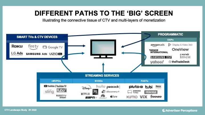
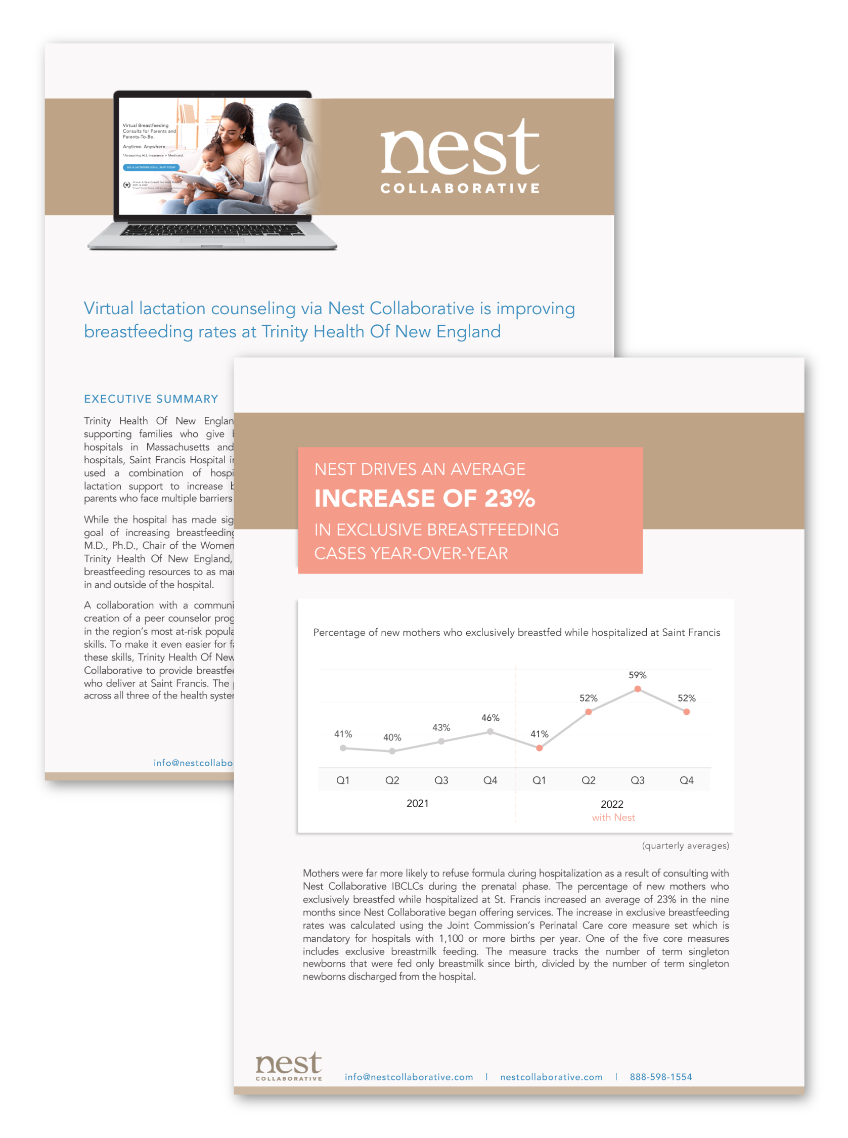
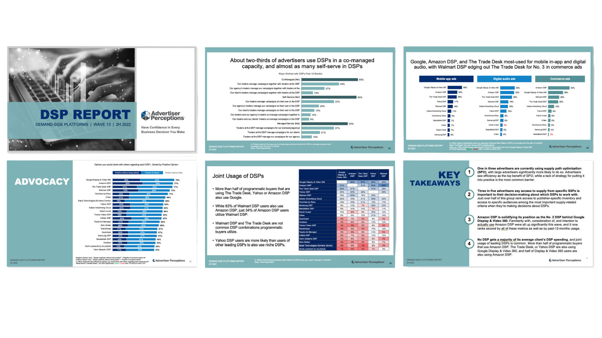
Data Visualization & Infographics
What does your data actually say? Most people can't answer that question from a spreadsheet. A well-designed chart or infographic makes it impossible to miss.
Complex information doesn't have to feel complex. Whether it's a single chart for a pitch deck, a multi-page research report, or a standalone infographic for a campaign, the goal is always the same: make the "so what" immediately clear to a busy audience.
This work is especially valuable for organizations that need to communicate data to people who won't read 30 pages of text, including board members, donors, investors, clients, and the general public.
What this includes: Custom charts and graphs, data-driven infographics, timelines, process diagrams, research report design, and visual frameworks that simplify complex ideas across any format or platform.


“Kim and her expert work in translating ideas and information into a visually compelling presentation is so much more that what you see on the finished product: her ability to architect the optimal flow of messaging for a high-stakes audience, and her guidance in how to communicate that information clearly and confidently as a speaker was beyond crucial to my successful delivery of a high-impact session to a room full of experts. I signed up for support in creation of a compelling deck, but I also got the bonus support of a confidence coach, cheerleader, and keynote advisor all in one. Cannot recommend her highly enough! “
— Courtney Reimer, Founder & CEO, Sounds Great Creative Podcast Strategy